DOCKETS ENTRY SEARCH
Court Dockets Reader
Bloomberg Law’s Court Docket content is the most heavily trafficked part of the platform. We ingest Court Dockets from Pacer and display them in a highly interactive document reader. Analytics show that the percentage of dockets searches makes up more than 30% of all searches, which is 20% higher than the second most searched content type.
BACKGROUND
Our Dockets content is unique from other document type, such as Court Opinions, in that it’s the only type of content that has sub-documents. These sub-documents are the heart of the dockets content, and users rely heavily on the ability to search and filter these sub-documents since there can sometimes be hundreds in a single docket. This causes the need for distinct workflows that allow users to get to this content more effectively in order to speed up their research process.
This is where entry search comes in. We call these sub-documents “entries”, and entries are classified using different types (e.g. complaint, motion, etc.). Originally, the user would need to conduct a basic keyword search and dig through entries on the docket until something stood out to them. This was a tedious and time-consuming process, so we set out to design a workflow that would provide users with a much simpler way of accessing entry content.
MY ROLE
Wireframing. Innovation. User Research. Iterating.
I was the dedicated UX resources on the Dockets Engineering team, along with several developers and a product owner.
We operated under 2 week development sprints, simultaneously testing designs while tagging docket entries to be more readily searchable. We testing early and often in order to figure out the best way to surface docket entry matches to our users.
STARTING WITH The USER PROBLEM
We conducted preliminary user research to discover the crux of the problem we were trying to solve and what our user’s biggest pain points were. This surfaced a few major problems that we aimed to remedy:
Users wanted the ability to search entries by type (e.g. complaint, motion, etc.)
Users didn’t want to have to click into each docket to figure out if there were relevant entry matches within that dockets.
Users wanted a way to quickly hide or filter entries that did not match their search so they didn’t have to scroll through hundreds of entries when only a few might be worth looking at.
Usability Testing
Next, it was time to begin to begin testing our prototypes using an iterative, sprint-based approach.
- 3 usability tests every 2-week sprint
- Each round of tests completed in one day
- Project team observes the tests
- Debrief as a team afterwards
- Adjust designs, prioritize work for the next sprint based on user feedback
BEGINNING THE ITERATIVE PROCESS
Based on our preliminary research, we set out to solve each of these major user problems.
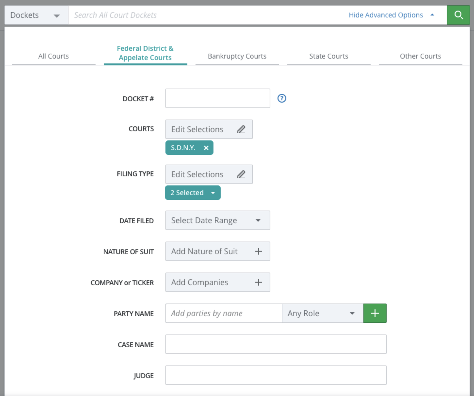
1) We began tagging our entries with a “type” tag, and updated our search form to allow users to search by entry type (along with keyword).
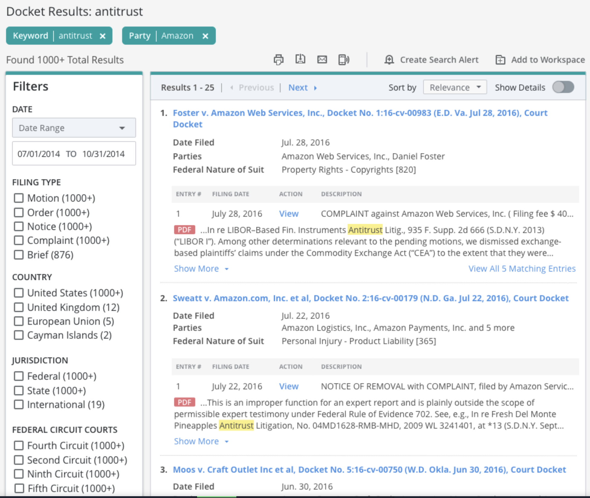
2) We began iterating on designs to determine the best way to display matching entries on the dockets search results page.
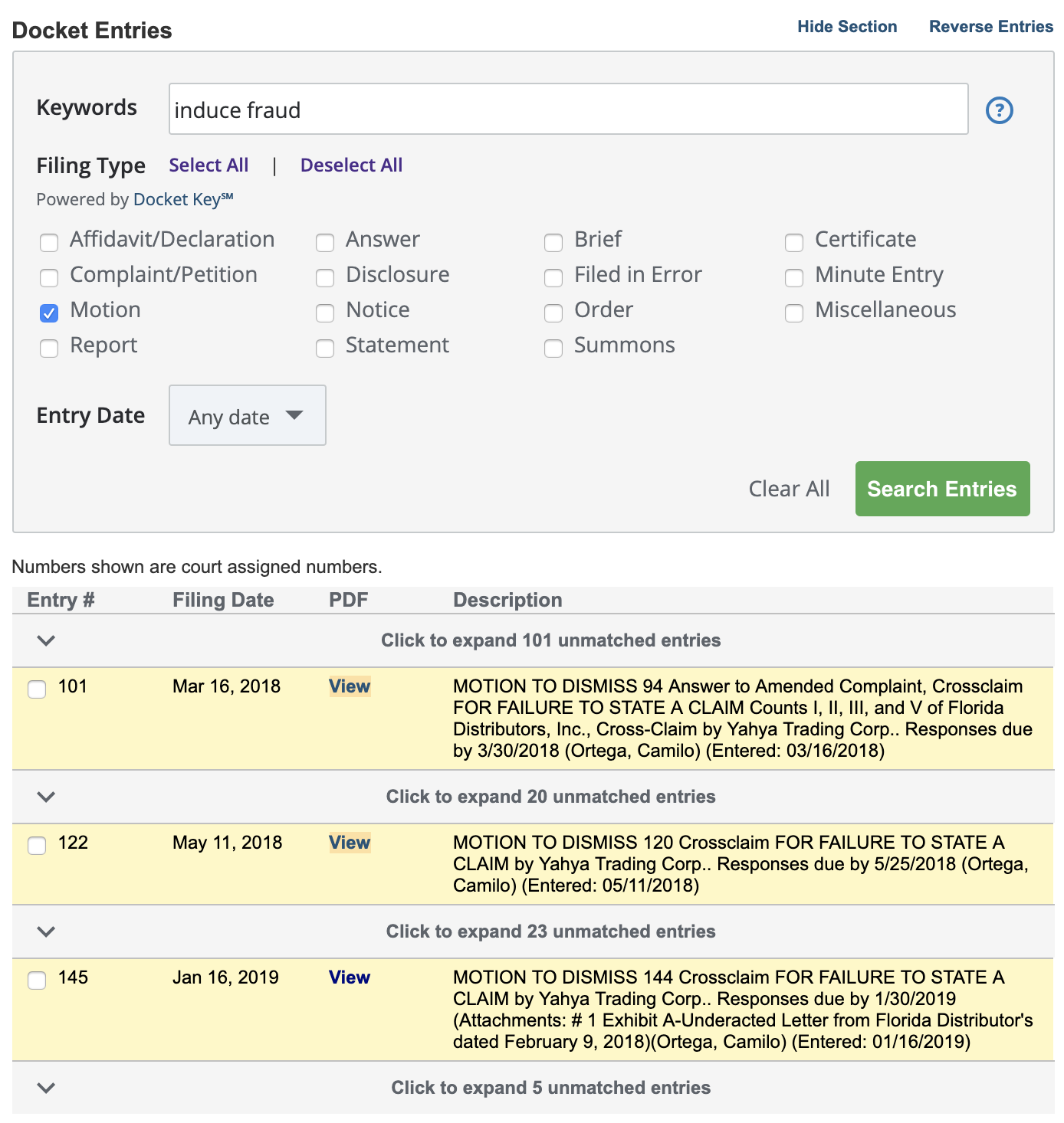
3) We provided robust entry filtering capabilities on the dockets document reader itself that would allow users to easily skim through matching entries.
Our initial iteration of designs for each user problem is shown to the left.
EARLY WINS AND WORKING THROUGH THE KINKS
Some of our designs resonated with users immediately, while others needed a lot of tweaking based on consistent, iterative feedback.
Search Form: The updates to our dockets search form were a quick win, users performed extremely well on tasks that asked them to add the additional “entry type” criteria, and had no trouble doing joint keyword and type searches.
Entry Filtering: While it requires some tweaking, the updates to the docket document reader were well received. Users quickly understood and appreciated the added functionality that allowed them to filter entries.
Search Results Preview: However, the search results display took some time to get right. Users struggled with the layout somewhat, and consistently asked for a simpler, cleaner display so they could skim through the matches faster, while having the option to see more matches right from the results page. So we set out to provide a more minimalist, yet flexible display.
GETTING CLOSER
Our next iteration of the dockets search results page was much cleaner. Users performed far better with the tasks they were given and expressed significantly higher satisfaction with the overall design.
1) We removed the additional text spanning the width of the entry table that was confusing users.
2) We provided more matches shown by default with the ability to see more form the results page.
In our final iteration, we wanted to clean up many of the more prominent features and make some small visual tweaks to ensure scannability of the results.

FINALIZING THE DESIGNS AND ADDING POLISH
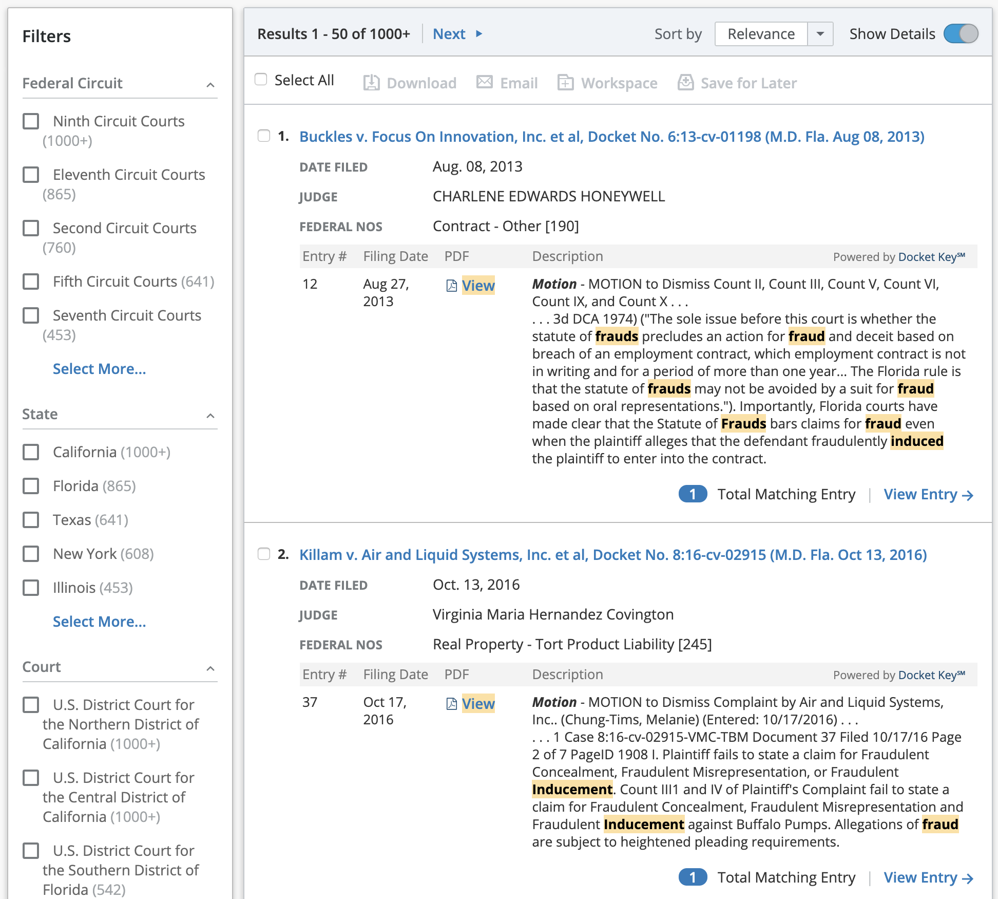
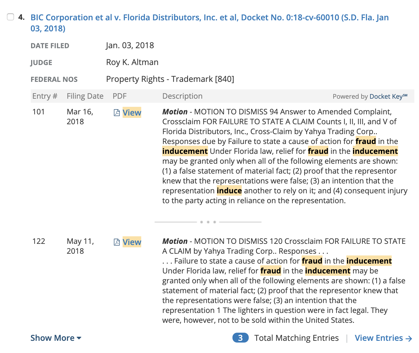
Our final iteration of the results page (left) shows the last round of changes we made to the design:
1) Formatting to help users identify the entry type more effectively and more space allotted to the entry text/description column.
2) Badges, icons and more prominent link treatment to the total matches label and the “View Matching Entry” link, which takes the user into the document reader and automatically filters the entry table based on their search.
3) Iconography and keyword match highlighting for the PDF links.
4) More clearly formatted keyword matches.


